Alpine
UX Case Study – (proprietary)
Alpine
If you loved The Big Box of Crayons as a kid and ask “Why?” a lot, chances are you think design systems are pretty rad.
Summary
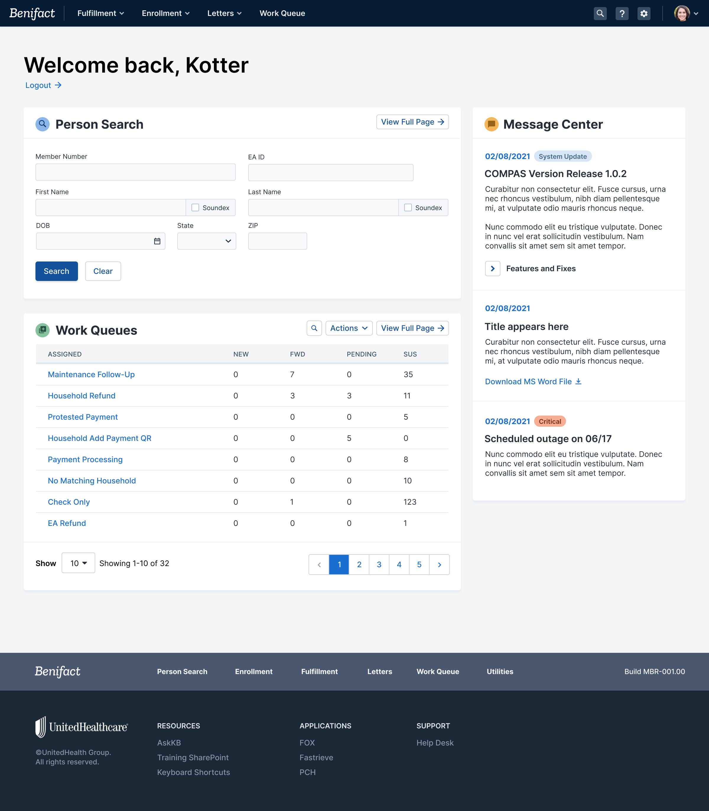
Our team’s success on UHC’s FOX project won leadership trust and a new initiative: create a proprietary design system to help UnitedHealthcare meet internal modernization goals at scale.
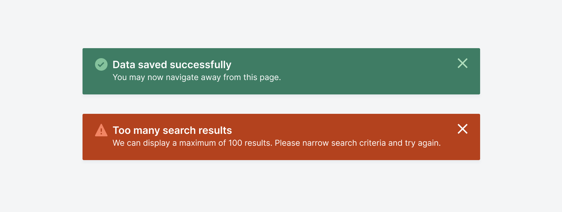
We called ours Alpine, and it provided broader accessibility, better user flows, clearer guidelines, and a component library with breadth and flexibility. My efforts designing, animating, prototyping, testing, organizing, and documenting Alpine’s features helped ensure that every aspect of the system supported a unified aesthetic experience and adaptable implementation.
My Process
part i
Think it through
Every design project begins with reading, copious sticky notes, and discussion. For Alpine, it was critical to perform a UI audit of the existing applications to see what we were facing. After distilling repeated elements, discerning patterns, identifying data types, and filling in feature gaps, I had a rough outline (AKA “The List”) of priorities and components to tackle.

overheard at the water cooler
“Does this meet accessibility standards?”
”Should this still be a table/link/button?”
”Does this navigation make sense? Is it responsive?”
”Is it appropriate/possible to restructure the information architecture?”
”What adjustments do users make to their browsers when using this?”
”Have we tried this before? Did it work?”
”Why is that teal?”
part ii
The Drawing Board
Our team established a cadence to individually problem-solve specific features & patterns from The List before presenting to the rest of the group. I like to sketch and annotate low-fidelity concepts on paper so the focus remains on position, hierarchy, and functionality at this stage.


part iii
The Wringer
During review sessions, each concept faced critique and probing questions. However, our team’s collaborative approach introduced new perspectives and use cases; the concepts with the most potential were then built into prototypes and user-tested. Often, the results supported our design hypotheses, but the tests themselves also revealed use cases we hadn’t considered.
part iV
Let’s build it!
Once an element is proven effective and adaptable through user testing data, I design the component, including its color palette, density variations, and interactive states in Figma. I also author the supporting documentation, create visuals, establish CSS tokens, and set styles including (but not limited to) “Type”, “Color”, “Effect” and “Layout Grid” into the design system. The result is a broad, flexible, and clear collection of guidelines that provide a unified aesthetic from visuals to voice and tone.


